Branding
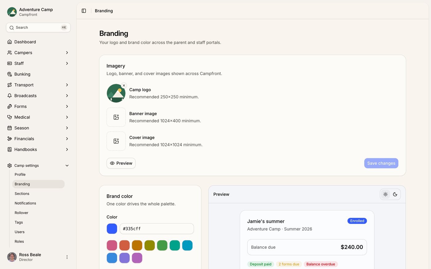
Under Camp settings > Branding you set the logo, images, and color that families and staff see across their portals. These apply to the parent and staff experience, not to your admin screens. This is where you make Campfront look like your camp for the people you serve.
Imagery
You can upload three images.
Camp logo - your mark, shown across the portals. Aim for at least 250 x 250 pixels
Banner image - the wide image at the top of portal screens. Aim for at least 1,024 x 400 pixels
Cover image - a larger square image used on welcome screens. Aim for at least 1,024 x 1,024 pixels
Click Preview to see how your imagery looks on a sample sign-in and dashboard before anyone else does. The preview reflects what's saved, so if you've just made changes, save them first.
Brand color
Pick one brand color and Campfront builds a full palette from it. That single color drives your buttons, highlights, focus rings, and selected states, in both light and dark mode. Enter a hex value or choose one of the preset swatches. Reset to default puts it back to Campfront's blue.
Keeping it readable
Some colors don't have enough contrast against text or backgrounds to be easy to read. Leave Auto-correct for accessibility switched on and Campfront nudges just the button color until it clears the WCAG AA contrast standard. Your brand color itself stays exactly as you chose it. Only the interactive shade shifts.
Turn auto-correct off and Campfront warns you when a color falls below AA instead of fixing it. Either way, the swatches below the picker show the resulting light and dark button colors with their contrast ratios, so you can see the effect before you save.
Wondering why a button doesn't match your exact hex? That's auto-correct at work. Campfront shifts only the button shade to keep text readable and leaves your brand color as you set it everywhere else. The swatches show both so you can compare.
Previewing light and dark
The live preview panel has a light and dark toggle, so you can check both looks side by side.
That light and dark toggle also sets your own admin theme. Flipping it here changes how the admin app looks for you too. It doesn't change anything for parents and staff.